A studio you can
get your hands on.
Five tools, five different jobs. The design challenge: give each one a distinct voice while making the collection feel like it came from the same pair of hands.
A catalog can tell you what exists.
It should also tell you why.
Blueprint tests an idea. Clarity explores a decision. Film Study examines a game. FORGE works with video, while Keystone looks at the foundation underneath an app.
A row of identical cards would hide those differences. The site needed a shared identity and enough room for each product to show its character.
Build a workbench,
then open the drawers.
The first interaction is a choice: pick a product. The stage changes with it—color, composition, and a small action that makes its purpose easier to understand.
Blueprint moves from idea to assessment to an assumption worth testing. The fixed HireSignal score is labeled as an example. The interaction demonstrates a way of thinking without pretending to run an analysis.
Try the workbench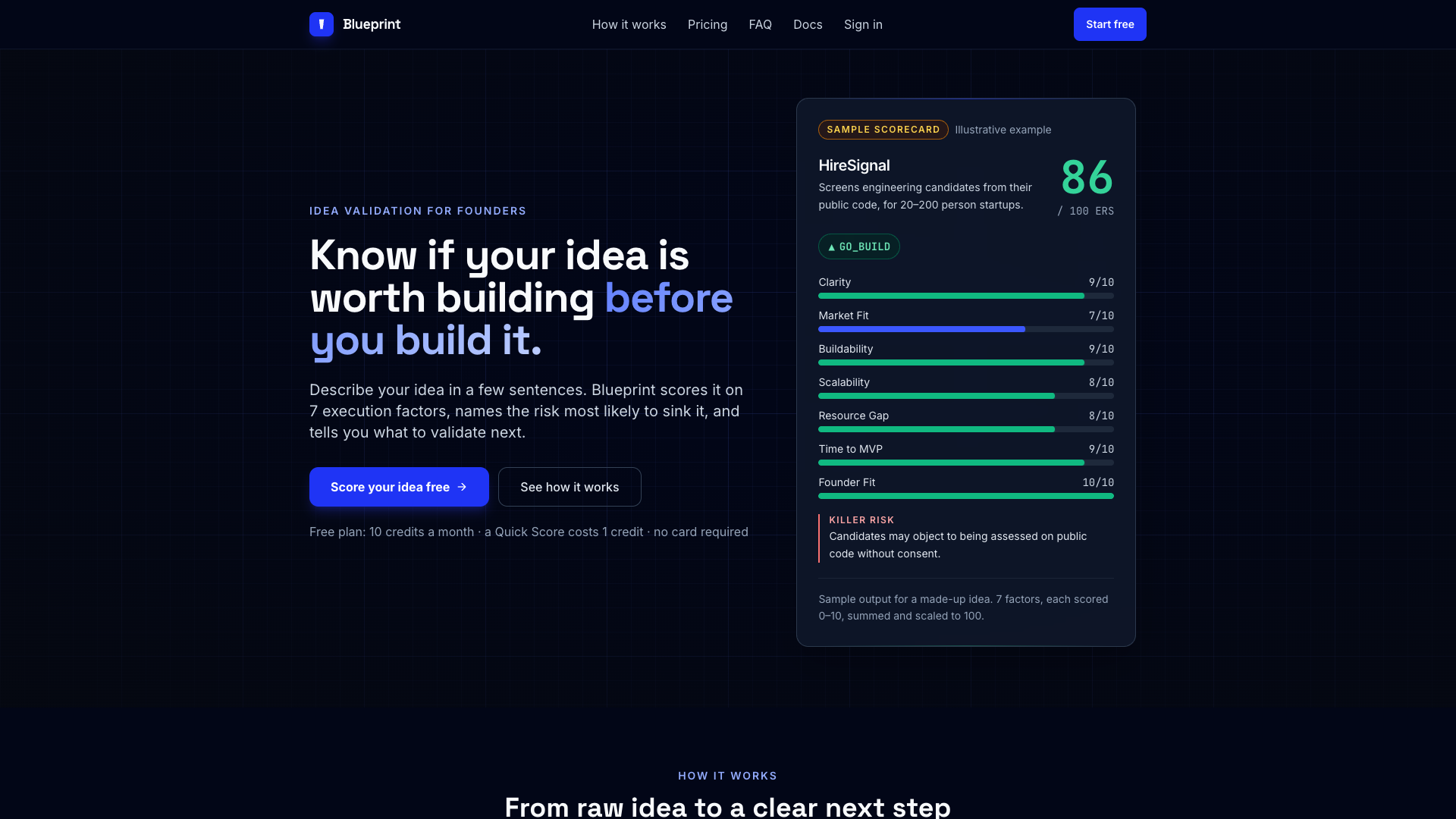
One frame.
Five personalities.
The dark studio frame uses cyan accents, clear typography, and quiet borders. A warm light theme offers a second way to view the same work. Georgia adds an editorial voice; Inter keeps the interface direct.
Within that frame, the product palettes do the organizing. Blueprint is analytical blue; Clarity is reflective green; Film Study uses the field; FORGE brings terracotta; Keystone uses structural gold.
Motion with a job.
A clear place to stop.
The product marker carries your selection across the workbench. Blueprint draws its example score. FORGE reshapes a frame. Keystone assembles its layers. These movements explain what changed, then settle.
Rapid input interrupts an unfinished transition. Reduced-motion preferences show the final state immediately. There is no perpetual animation and no scroll hijacking.
See the interactionsThe quieter details
carry the experience.
- Arrow keys, Home, and End navigate the product tabs.
- Native dialogs support Escape and return focus to the opener.
- The mobile menu exposes every section and closes after a choice.
- Section links account for the sticky header.
- Fonts, artwork, and scripts are served with the site.
- Each product’s availability is labeled separately from its sample.
A small introduction.
An honest one.
The workbench is a set of illustrative samples. It does not run AI models, analyze uploaded footage, export clips, or provision infrastructure. Links to available products take you to the actual experience.
The site is built with HTML, CSS, and JavaScript, using native browser animations. Its responsive layouts and keyboard interactions are checked in the browser. Those checks are not a formal accessibility certification.